Apple just held its latest product launch/event online. This iPad-centered event launched three new products:
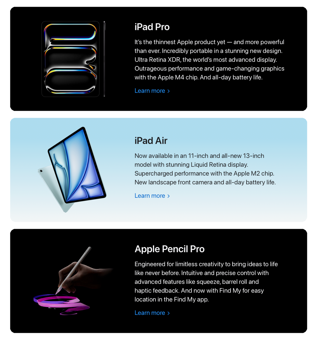
Each of these are about what you'd expect from Apple after dominating the devices space since 2007/2008. My advice on these products is always the same; if you're a first time buyer go for the new model or the refurbished version of last years depending on your budget.
If you're upgrading, unless there's an actual feature you need—or really, really want and are willing to pay for it—wait until you hit the reasonable life span of your device. For iPad, I've found that tends to be somewhere between 3—5 years.
In my case, I'm trading in my existing M1 iPad Pro (2021) for an upgrade to the new iPad Pro because it's my primary device and should now completely replace my M2 MacBook Air.
But, this post isn't about the products. Or at least it's not about the products more than I've already mentioned them for context.
If you want to the details of the products, check out the coverage from The Verge or watch the YouTube coverage from the likes of MKBHD, Mrwhosetheboss, or iJustine.
The presentation
What I want to talk about is the presentation itself. The actual delivery of the information. Weird, I know. But I do a lot of work related to cybersecurity and privacy communications and how Apple delivers information is fascinating.
First, if you'd like to watch the event, check it out in full 👇.
This is a highly polished, cinematic event. Few companies have the creative culture, expertise, and the absurd budget to pull this off.
Some of the delivery was a bit understandably stilted—these are tech executives, not actors—but overall at or above the level of reasonable business speakers. Part of that is practice, another critical part is that fact that this was a recorded event.
Getting multiple takes to deliver a line helps. A lot. So does a professional editing team. But there were five techniques Apple used that made their presentation a lot more impactful.
These techniques don't just apply to major events like this. You can use them when you're building out a talk or just trying to frame out a narrative.
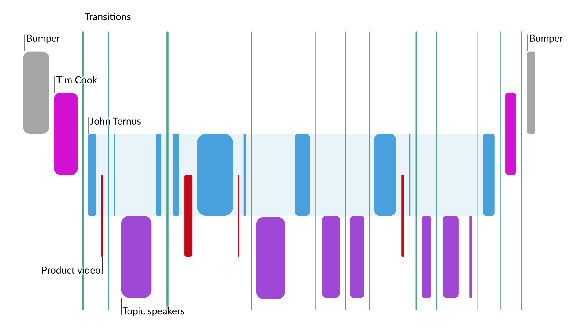
I started analyzing an event like this with a visual. This helps to bubble up patterns and the overall flow of the content. Here is what the 07-May-2024 Apple event looks in terms of speakers and timing:
Clear topics and expertise
Each speaker during the event speaks only to their implied area of expertise. It's subtle, but once you spot the technique, its value becomes clear.
Tim Cook (CEO, Apple) opens the event and sets the stage, "We have a huge day of announcements ahead of us, and it's all about iPad". Tim provides some updates on other Apple efforts and then steps back.
John Ternus (SVP, Hardware Engineering) is the primary narrator for the event. Every time he's on screen, he's either talking about how customers use the products, recapping what other speakers have said in a business content, or introducing new topics at a high level.
The only announcement John makes is the display technology they've branded as "Ultra Retina XDR" which is powered by a tandem OLED approach. Apple will most likely use this technology on other products like the MacBook Pro and the Pro Display XDR. This is a portfolio level technology and that falls into John's direct responsibilities.
The other speakers address a very specific topic when they are on screen:
- Melody Kuna (Director, iPad Product Design) talks about the iPad Air
- Tim Millet (VP, Platform Architecture) discusses the advantages of the M4 chip
- Will Hui (Product Manager, Creative Apps) walks the audience through the new Final Cut Pro and Logic Pro for iPad, as well as the new Final Cut Camera for iPhone
- Leslie Ikemoto (Director, Input Experience) dives into the changes the Apple Pencil Pro brings
- Customer speaker, James Cuda (CEO, Procreate) highlights how the new Apple Pencil Pro can make artists workflows smoother using Procreate and Procreate Dreams
Each of the Apple speakers are bookended by John setting up their segment and then recapping the key points they brought up. This establishes clear authority and makes each segment more believable.
A great example of this is pricing information. Only John talks about pricing. None of the other speakers even hints at pricing or timelines. Pricing and timing are concerns for the broader business and that is framed as John's area of responsibility.
This has the added advantage of saving each expert from appearing to be directly selling to the audience. Despite this being a ~40 minute product showcase and marketing effort, the separation of information helps keep the audience from thinking about that aspect of the event.
With this approach, not only is the authority of each speaker implied and reinforced, it allows a natural repetition of key messages when John recaps the key points from each speaker. That's hard to pull off in a way that doesn't feel forced, but with this format it happens automatically.
Cadence and pacing through repeated patterns
If we look at the visualization of the event again, we can see a repeating pattern.

John will introduce a product or technology, the show a hype video, and then an expert will dive deeper into that topic.
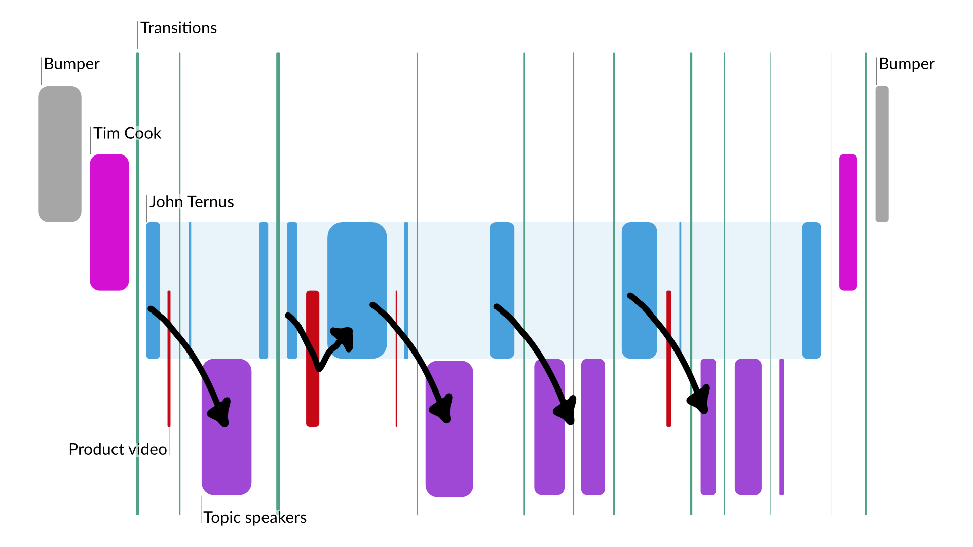
The pattern has two exceptions. When the display technology is discussed (the second occurrence of the pattern) and when the new Final Cut Pro and Logic Pro apps are introduced (the third occurrence).
The display technology is being positioned as foundational and will more than likely appear in other products. This makes John the right voice to dive deeper.
For the apps, there is no hype video. The apps are the only software introduced in this pattern. Each hype video features the hardware, so skipping it here makes sense. The deeper dive also serves as one longer hype video showing the software in use and subtly highlighting key user experiences.
If you're curious, the hype videos are for the iPad Air, iPad Pro, M4, and the Apple Pencil Pro
This pattern sets a cadence for the audience. That cadence helps build anticipation and makes gives the content the best chance to land on a positive beat.
Using this pattern helps the pacing of the event. Announcements are made with regular frequency and allow the audience to digest enough of the information that they don't feel overwhelmed. And just as importantly, the pacing is quick enough that the audience doesn't tune out.
Far too many presentations fall flat in some areas and the audience tunes out. Sometimes literally. Other times, they just disconnect from the presentation which makes it less likely for your other messages to land.
Visual appeal
Apple is famous for the production quality of their events. As they've shifted to this streaming delivery model, that quality has skyrocketed. This event is no exception.
While the rest of us may not be able to match this level of production quality, key aspects of their approach are the third technique that made this event stand out.
The first part of this technique is almost every shot in the presentation was dynamic. Apple achieved this by having speakers deliver their segments on a live set...or at least live enough that it didn't matter.
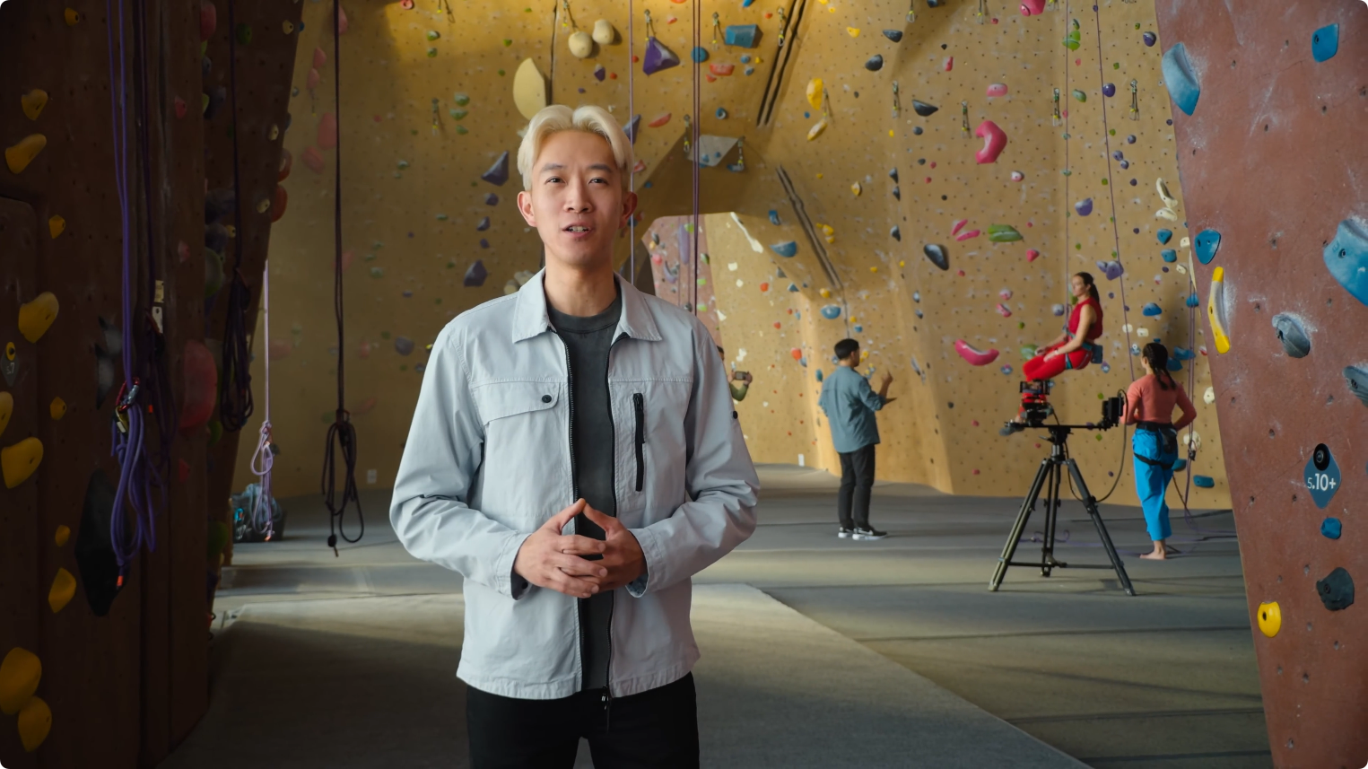
Will Hui discussed the updated Final Cut Pro and new Final Cut Camera apps while in a climbing gym. This provided visual interest as the climber and film crew are working in the background will Will is talking.
It also set up a very natural product demo. As Will introduces the features of the product, the visual changes to the perspective of the film crew using the very same features to film the climber.
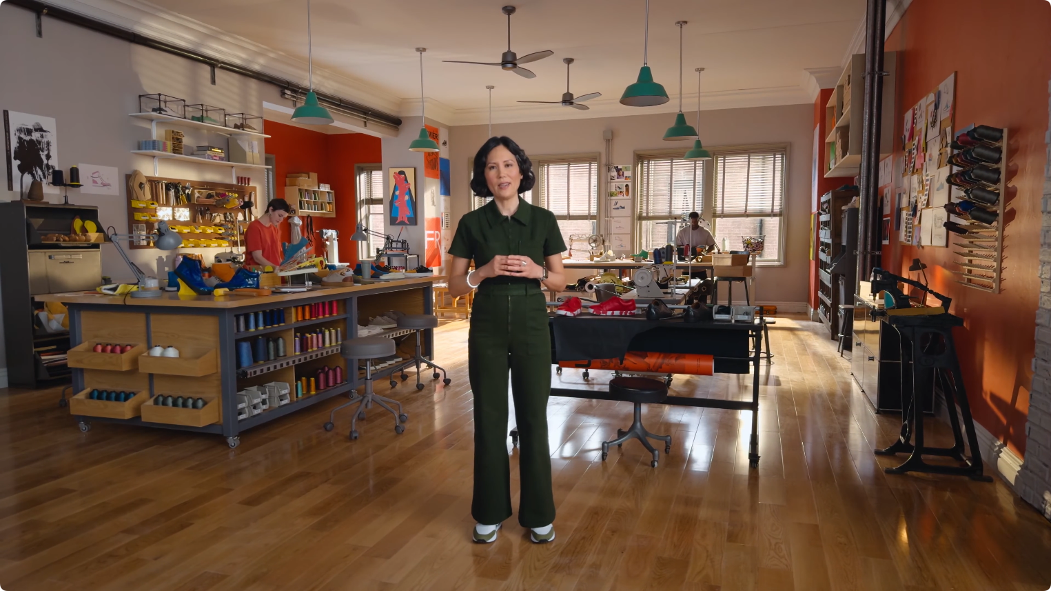
Leslie Ikemoto discussed the new Apple Pencil Pro in an arts studio. The background is filled with bright and interesting objects and two artists are quietly working throughout the segment.
Again, this allows the product features to be shown in a very organic way while also ensuring there's always something new and engaging on screen.
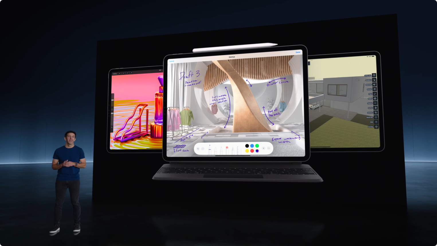
Even when John Ternus is on screen with a more traditional speaker+slides approach, there are some techniques at play. John is in dark clothing, the stage is dark, and the "slide" has a pure black background.
These leads the audiences eyes to the product. It's bright, bold, and the center of attention...which is exactly the point.
Every speaker in this event delivers their segment from a new location. Taking things a step further, Apple even adds a second area to a location for speakers with two main topics. Leslie segues to James Cuda in the next room and Will Hui segues to himself in a music studio.
Every topic has it's own visual identity and there is always something dynamic and engaging on screen.
You may not be able to replicate this exact approach, but it definitely makes the case for more variety in slide design—no more standardized templates!—and for you to switch it up between the speaker, slides, and other views you can pull together.
Smart comparisons
Apple has (in)famously always provided benchmark and comparisons using vague numbers. This is up to 2x faster than that. This is the "most powerful device of its kind."
This event is no exception, however it does provide an excellent example of making a product look good and avoiding a negative reaction for another product.
Launching the M4 in the iPad Pro was a smart move.
When the M3 line of chips launched, there was pushback—understandable so—that it was a minor increase from the performance on the M2 line. The independent benchmarking data backed this up.
The M1 was such a massive jump over Intel and AMD processors in similar class machines at the time, it set unrealistic expectations. When I got my first M1 powered Mac, I was blown away. The on-paper specs didn't do it justice. It was fast and power efficient which allowed Apple to optimize their existing, iconic designs.
M2 was a solid upgrade, but not revolutionary. There was no way the architecture was going to provide M3 or even M4 with another massive jump.
Launching the M4 in the iPad Pro allows Apple to cite direct comparisons in performance improvements against the last version of the iPad Pro. The M2 iPad Pro.
You may notice that 4-2 is 2. The cited benchmarks on the chip skips a generation. That will definitely make the numbers look better.
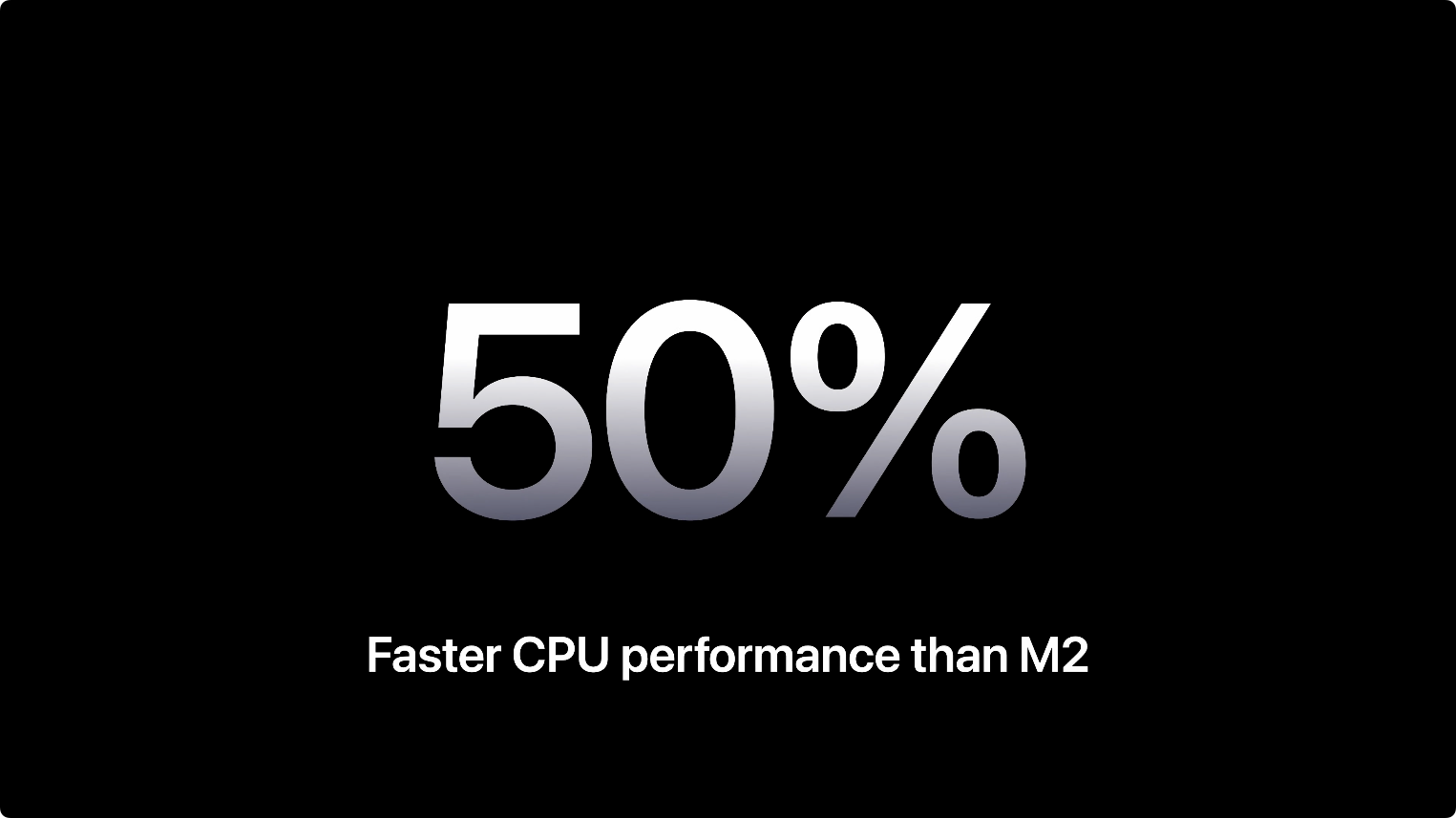
The actual performance numbers vs. the M3 are still solid. Early Geekbench reports seem to indicate a ~20% improvement in single-core CPU performance and 24% in multi-core performance. There GPU and AI (Neural Engine) benchmarks are different.
But the over the M2, it's a ~45% increase in single-core and for multi-core. Last I checked, 45 is a bigger number than 25 and bigger numbers usually sound better!
Here are the average Geekbench scores for the M-series of chips, if you're curious 👇
| CPU | Single-core | Δ | Multi-core | Δ |
|---|---|---|---|---|
| M1 | 2,369 | 0 | 8,576 | 0 |
| M2 | 2,596 | 0.0958 | 10,062 | 0.1733 |
| M3 | 3,125 | 0.2038 | 11,863 | 0.1790 |
| M4 | 3,767 | 0.2054 | 14,677 | 0.2372 |
Common ground
The last technique Apple used helped the audience see themselves using these products.
The event really gets underway with John speaking from a commuter train. Then it features a library, a hardware lab, a climbing gym, a music studio, and an artists studio.
The only other locations are the Apple campus walkway—when Tim Cook is speaking—and the mysterious basement room with the big screen (which I assume is a digital stage).
Each of these scenes is relatable or at least understandable. The same thing applies to the use cases they show. Talking to friends on FaceTime, studying in the library, playing games to pass the time...you can see yourself doing each of these activities.
This relatable, but still aspirational portrayal of these products helps the audience connect with the messages.
To reinforce this, Apple also name dropped 12 different third party apps and showed most on screen. Apps that anyone can get these apps today or at least can get soon for the two games:
- GoodNotes: Used by college students with Apple Pencil for note-taking, from classroom to dorm room
- QuickBooks: Employed by entrepreneurs for managing small business finances on the go
- Zoom: Used for video calling, benefiting from the larger display for viewing more participants
- Affinity Designer 2: For business promotion and creative tasks, taking advantage of the M2 chip's fast performance
- Zenless Zone Zero and...
- Assassin’s Creed Mirage: Games mentioned for their graphic intensity, playable due to the new iPad Air's enhanced performance
- Photomator: A machine learning tool for enhancing photos with models trained on millions of professional images
- Procreate and...
- Procreate Dreams: Used by illustrators to create artworks
- SketchUp: Helps 3D designers conceive projects
- Shapr3D and...
- ZBrush: CAD design and 3D modeling/sculpting tools mentioned as powerful apps on iPad Pro
That's on top of Apple's own apps they mentioned. The only thing out of reach here is the new Final Cut Pro, Final Cut Camera, and Logic Pro updates. They all will be available "later this spring".
All together though, this contextualizes the messages in a relatable way. Each choice is deliberately made to help you picture yourself using these products.
Two failures
Despite this being a well produced event, there were two aspects that fell flat during the presentation.
The "hype" video for the M4 was bizarre. It's simply a rotation rectangle—ok, rectangular cuboid—with the label M4. This could have been a lot more and/or could have been a simple Keynote slide animation.
It feels like it was a placeholder and the team tasked with the actual hype video wasn't able to deliver on time.
The second whiff was the hype video for the iPad Pro. It's visually appealing, but it hasn't been well received online. Apple has posted the video on its own to YouTube so you can easily watch it and make you're own call.
For me, this tweet by Lulu Cheng Meservey sums it up nicely:
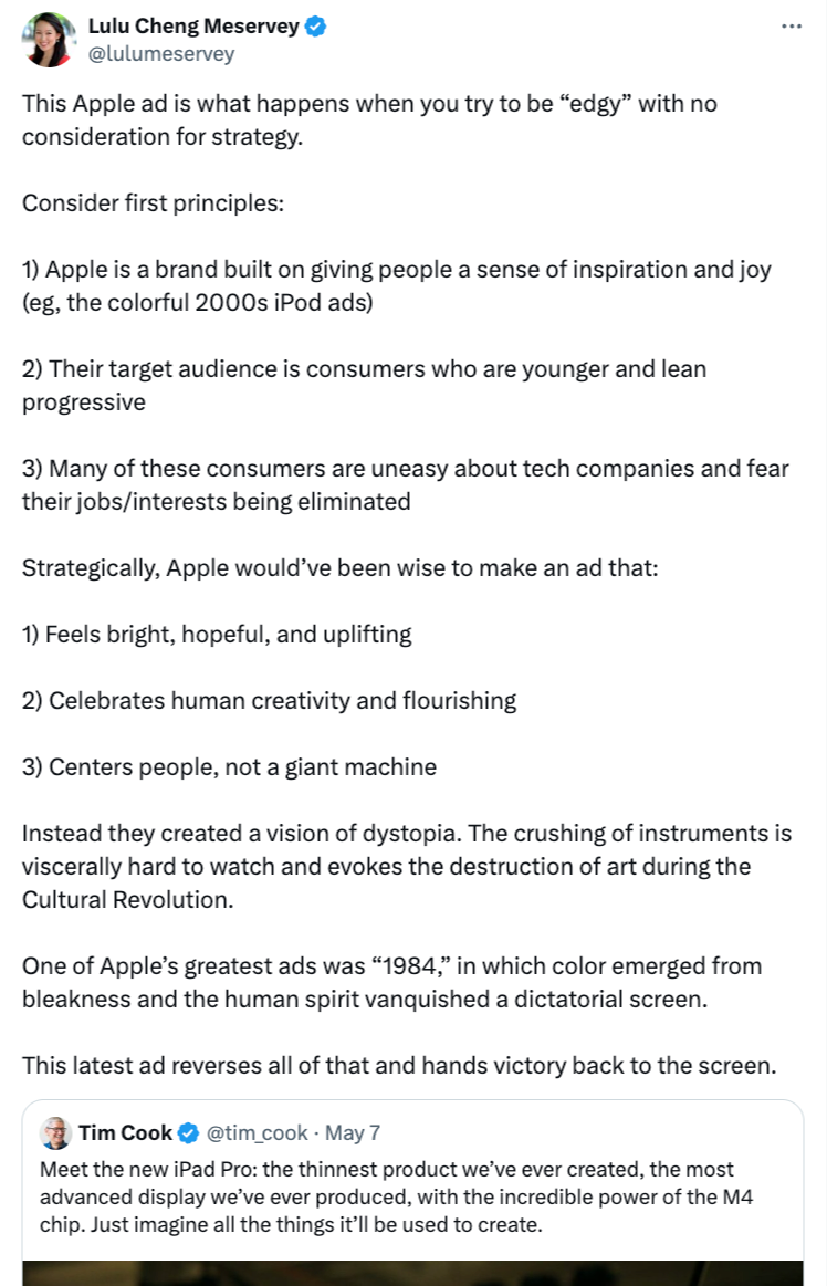
The pushback on this video grew quickly after the event to the point where Apple has now apologized and said that they won't be using that ad moving forward.
Key takeaways
Whether or not you're interested in these products or Apple, it's hard to deny that this was an impressive and effective presentation. Even if you can't afford the price tag for this level of production quality, you can still learn from this event.
If you're talking to 20 people at a user group or 2,000 at a major event, these five techniques can up your game. Remember to:
- Use clear topics and expertise
- Set a strong cadence and pacing through repeated patterns
- Create visuals and shots that have visual appeal
- Use smart comparisons
- Find common ground with your audience


